typography & fonts
Typography is an important tool in maintaining a clear, well-defined and consistent brand.
PRIMARY TYPEFACE
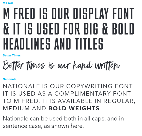
The typeface M Fred, Better Times and Nationale should be used for all professionally produced communications. There fonts are available with a wide range of appropriate weights, allowing for the creation of a clear information hierarchy with appropriate emphasis. The combination of the the three fonts give texture to our communications.
M Fred is our headline font. Its tall uppercase letter forms and blocky style allow it to be used for impactful and visually distinctive headlines.
Better Times is our script or hand writing font. It is used to add a human element to our communications.
Nationale is our text or body font. This compliments M Fred and is used both as a subheading and in smaller body text.
PRINT COMMUNICATIONS
The typeface Arial should be used for operational applications such as Microsoft PowerPoint and email messages. Arial comes as a standard system font on all PC computers.